HOW TO SEE TIME IN A CONSISTENT AND (SOMEWHAT) COMPREHENSIBLE TIMELINE?
At some point in 2021, I was watching a YouTube-video about the Cambrian explosion 541 million years ago and realised something. Why do we always talk about these past events in “years ago”, is there a way to see them on a consistent timeline, with some kind of proportion? I couldn't find such a visualization online and in my favorite dataviz sources. The past seems too vast to be shown linearly while logarithmic representation is hard to comprehend. So I ventured to do the Viz on my own.💪
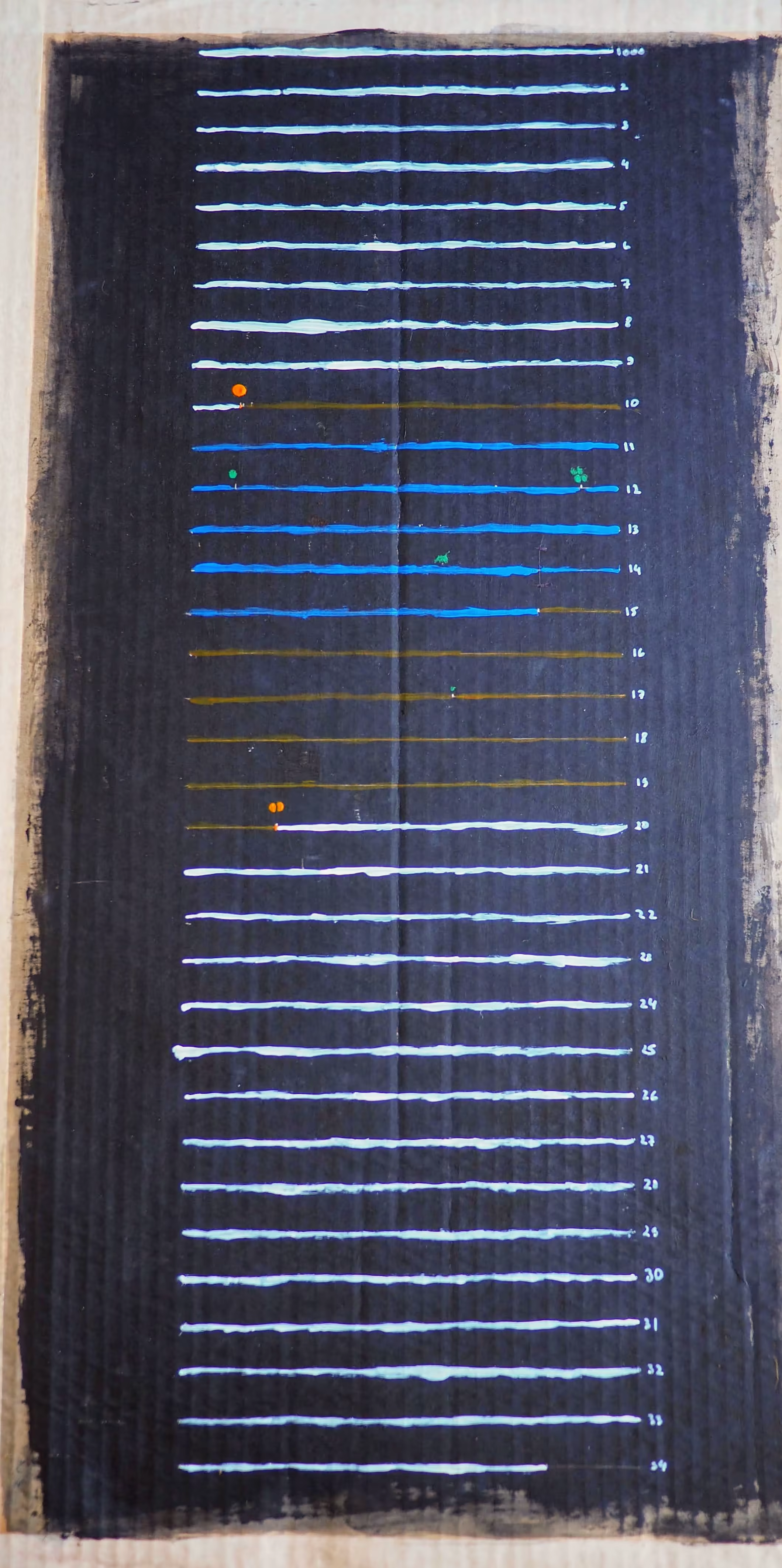
I wanted to have the Big bang (13,8 billion years ago) as a starting point and then map some of the significant events after it until a possible End of the universe in 20 billion years.
In Excel, I mapped most of the events in a relative timeline and calculated the distances between them in million years.
In a notebook, I choose one row of 20 squares to represent 1000 million years, or 50 million in one square. Later, I wanted to do it on a bigger scale. The result is on the left, as acryl on carton, 70x50 cm.
⬜ White are the years in which our solar system didn’t exist and won’t exist. The orange ball is the creation of our sun and the split orange is its (metaphorical) death when it runs out of hydrogen.
🟫 Brown is the time the Earth exists without oceans. There is an estimation that in billion years, the average temperature will raise up to 47° and evaporate the oceans.
🟦 The blue lines symbolise the time there is water on our planet.
🟩 The first green dot shows the beginning of one-cell life, the many dots - multicellar life. The green dinosaur also made it to the big picture.
Do you see where our, human, history is on the scale of all this?

I decided to use a single hair to show how short our human history is. Turns out it was too big.
A human hair is approximately 80,000- 100,000 nanometers wide.
A nanometer is one billionth of a meter.
On the scale of this project:
1 meter = 5 billion years
1 nanometer = 5 years -> a human hair represents about 4-500 000 years
But humans evolved "only" about 200 000 years ago. So even a hair gives humanity too much room on the grand scale of everything 🤯